Read Charts and Describe Price Structure
Section 1 of 4
Read the chart feed and candle
Your learning goal
Describe a chart consistently before forming a trading hypothesis.
A chart condenses recorded prices into a picture. Before interpreting it, identify the asset, quote currency, venue, timeframe and scale. Those choices can change the story the picture appears to tell. We will read ordinary candles and simple price structure, then use indicators as summaries of data rather than promises about the next move.
Key idea
State what the chart records before stating what you think it means.
Education only. Crypto assets can lose substantial value or become worthless. No lesson requires buying an asset, depositing money or sharing real passwords, private keys or recovery words.
Why does a crypto chart need extra care
Picture a weather station on a mountain in Canada that records the temperature every minute, all year. There is no "closing time" for weather. For a daily summary, someone has to choose when each day begins, and people in Toronto and Vancouver might choose different midnights.
Crypto prices are like that station. As you learned in Level 0, crypto trades 24 hours a day, 7 days a week, every day of the year. A chart still has to cut that endless stream into pieces, so every crypto chart rests on choices someone made for you: which exchange, which trading pair, which time zone, which time window and which scale.
This lesson teaches you to read those choices before you read the shape, the same habit the PipStart Forex path builds. The aim is description: "this is what the record shows", and no further. The analogy stops working in one place. Weather does not react to people reading the thermometer, but markets do react to people reading charts. Start with the smallest building block: the candle.
Read a candle on a market that never closes
A candlestick summarises one time window with four prices: open, high, low and close. The body runs from open to close; thin wicks reach to the high and the low. Up and down colours are settings, so check the legend.
On a Forex chart, the daily candle follows a provider's trading day. Crypto has no session, so the "daily close" is a convention. Many crypto charts use midnight in Coordinated Universal Time (UTC), but some let you switch to local time. A trader in Tokyo on Japan time and a trader in London on UTC can see differently shaped daily candles from identical trades.
Because there is no weekend pause, crypto charts rarely show the "gaps" you see on stock charts. That does not make crypto calmer: large moves can happen at 3 a.m. on a Sunday, when fewer people are watching. Once you know what one candle shows, the next choice is how much time each candle covers, and how the price axis is drawn.
Ask whose price and whose volume you are seeing
Imagine checking the price of a mango in three Jakarta markets: Rp10,000, Rp10,500 and Rp9,800 (invented prices). None is "the" price of a mango. Each is the price at that stall, at that moment.
The same distinction helps when discussing crypto. As you saw in Level 3, a coin trades on many exchanges at once, each with its own order book. Prices are usually close, because traders buy where it is cheap and sell where it is dear, but in a sudden crash they can drift far apart. "BTC/USDT on Exchange A" and "BTC/USD on Exchange B" are two different records.
Volume bars show how much traded in each window. Crypto volume is split across hundreds of centralised exchanges, decentralised exchanges and over-the-counter desks, so any single chart shows only a slice. Data sites add the slices together, and that is where a bigger problem appears.
Wash trading inflates volume. Coin Metrics, a data firm, recalls a 2019 Bitwise study that claimed around 95% of reported volume was "fake", and screens exchanges for suspicious patterns, such as buys and sells that look like random coin tosses. Chainalysis estimated up to about US$2.57 billion of suspected wash trading on three blockchains' decentralised exchanges in 2024, and called that an upper-bound estimate. In October 2024, US authorities charged several market-making firms over wash trading (the token research lesson in Level 5 describes the case).
So prices differ by venue, and some volume is not real. With those cautions in mind, revisit the most familiar chart tool of all.
It does not tell you the exact sequence of every intervening trade. Synthetic chart types may transform prices and are not ordinary execution records. Candlestick charting has historical roots in Japan's eighteenth-century rice markets, rather than beginning with cryptocurrency. This history does not make a pattern predictive by itself; any claim about future usefulness still needs a defined method and evidence.
Section 2 of 4
Describe structure, volume and indicators
Trends, ranges, support and resistance
A sequence of higher swing highs and higher swing lows can describe an observed upward structure. Lower highs and lower lows can describe a downward structure. A range describes repeated movement within a broad area. Support and resistance are reference areas where buying or selling has previously been associated with a reaction; they are not physical barriers.
How you choose swings and areas matters. State the timeframe and rule used, and avoid moving a line afterward to make it look perfect. A breakout can fail and a previously respected area can stop producing a reaction. A chart annotation is an observation or hypothesis. A useful beginner description says what happened and what evidence would change the interpretation, without predicting that a level must hold.
Volume averages and momentum
Volume describes recorded trading activity under a feed's unit convention. It may count base units, quote value or contracts, so compare like with like. A simple moving average takes the arithmetic average of a chosen number of values, commonly closes. With closes 100, 102, 101, 105 and 107, a five-period average is 103. It summarises past data and can lag a rapid change.
Momentum indicators, such as RSI, summarise aspects of past changes under specified settings. A high reading does not force a fall, and a low reading does not force a recovery. Several indicators based on the same price series are not independent evidence simply because their lines have different names. Use a small number of clearly understood measures and record settings. A complex display can conceal the absence of a testable decision rule.
| Item | Supplied values | Interpretation |
|---|---|---|
| Open | USD 100 | First included trade |
| High | USD 108 | Highest included trade |
| Low | USD 97 | Lowest included trade |
| Close | USD 104 | Last included trade |
| Five closes | 100 102 101 105 107 | Sum 515 |
| Five-period SMA | 515 divided by 5 | 103 |
Ordinary fictional candles are assumed. These observations do not forecast the next interval.
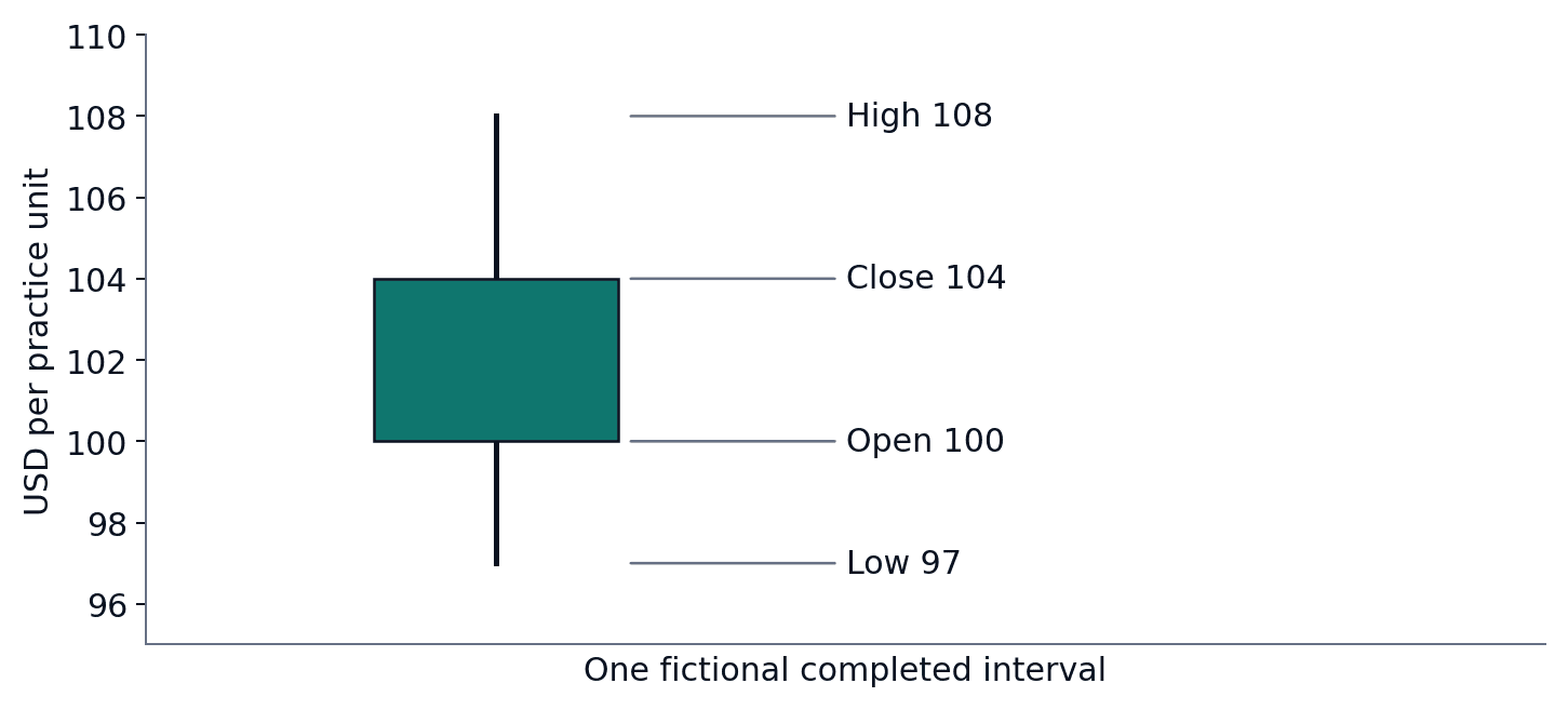
Read diagram as text
The body runs from the USD 100 open to the USD 104 close.
The upper wick reaches USD 108; the lower wick reaches USD 97.
This is one fictional completed interval. The candle does not show the order of every trade within it.
Section 3 of 4
Compare timeframes, venues and scales
Timeframes and venue differences
A daily candle contains many shorter-period candles. Short-term structure can therefore move against a longer-term trend without either chart being mathematically wrong. A feed from one exchange can differ from another because of liquidity, trading pairs, outages and participant activity. Index data combines sources under a methodology and is not necessarily an executable quote.
Check timezone, missing intervals and whether a candle is still open. A closing-price rule cannot legitimately use the final close before the interval ends. Volume from a thin pair may not represent the wider market. Compare data quality and source definitions before diagnosing a contradiction. These habits also prevent look-ahead mistakes when we test rules at Level 9.
Linear and logarithmic scales
Think of a family photo album. One page shows a single birthday party in twenty photos; another shows twenty years in twenty photos. Both are true, but they tell different stories. A chart's timeframe works the same way: a one-minute chart shows tiny wiggles, a weekly chart the long journey.
The Forex rule still applies: to combine shorter candles into a longer one, take the first open, the highest high, the lowest low and the last close. Never average them. A calm-looking weekly candle can hide a very rough Tuesday.
The second choice is the price scale. On a linear scale, each step up the axis adds the same number of dollars. On a logarithmic (log) scale, each step multiplies the price by the same amount, so equal distances mean equal percentage changes.
Percentage change = (new price − old price) ÷ old price × 100| Comparison point | Linear scale | Log scale |
|---|---|---|
| Equal distance means | Equal dollar change | Equal percentage change |
| Good for | Short periods, small price ranges | Long histories where price rose or fell many times over |
| Risk of misreading | Early years look flat; recent moves look enormous | Large dollar losses can look gentle |
| What to check | The axis labels | The axis labels |
Bitcoin's history spans prices thousands of times apart, so long-term Bitcoin charts often use a log scale. Neither scale is "the truth"; each answers a different question. Once you have chosen window and scale, a quieter question remains: whose prices are on the chart at all?
A move from 10 to 20 and from 100 to 200 has the same percentage change but different absolute amounts. Long histories with large price ranges can look very different under the two scales. A chart cannot by itself explain token rights, custody or contract risk.
Section 4 of 4
Everyday example, practice and review
Try the following questions aloud or on paper before opening the worked answers. Compare your reasoning as well as your final answer.
Try it yourself
Try each question on paper or explain your answer aloud before opening the worked answers. This practice is for learning; it is not scored.
1. Use the table’s candle: open 100, high 108, low 97, close 104. Describe its body and wick range.
2. Calculate a three-period average of 102, 105 and 108.
3. What is wrong with testing a daily-close signal using the final close at noon?
Compare with the worked answers
Worked answers
1. The body runs from 100 to 104; wicks extend to 97 and 108.
2. The sum is 315 and the average is 105.
3. The final daily close is not yet known. Using it early introduces future information into the test.
Quick knowledge check
Try each question on paper or explain your answer aloud before opening the worked answers. This practice is for learning; it is not scored.
Does a resistance area guarantee a price reversal?
Compare with the worked answers
Worked answers
No. It is an observed or hypothesised reference area. Price can pass through it or react differently later.
What to remember
✓ Identify data source, interval and units before interpretation.
✓ Indicators summarise inputs under settings.
✓ A descriptive pattern is not a guaranteed forecast.
Lesson completion check
References and further reading
References
TradingView: Introduction to candlestick charts and patterns ↗
TradingView: Simple Moving Average ↗
MIT OpenCourseWare: Blockchain and Money ↗
Coinbase: Advanced trade order types ↗
CFTC: Understand the Risks of Virtual Currency Trading ↗
US SEC: US SEC — Statement on the Approval of Spot Bitcoin Exchange-Traded Products ↗